← Back to work
Branding UI Design Hospitality

for Nordic Unique Travels

Aito Igloo & Spa Resort

Nordic Unique Travels was opening a new Lapland resort and needed it to exist before it existed. I built the brand and the website that made Aito feel real, from the logo out to the booking flow.

Role
Branding & Lead UI Designer
Client
Nordic Unique Travels
Duration
Nov 2023 – Jan 2024
Scope
Identity + 6-page site
aitoresort.fi
Aito Igloo & Spa Resort website home page, Delights of the Arctic
Overview

Designing a resort that didn't have a single guest yet.

Aito Igloo & Spa Resort was a brand-new property from Nordic Unique Travels. There were no photos of happy guests, no reviews, no history, just a vision of luxury and sustainability in the heart of Lapland. My job was to give that vision a face people could trust enough to book.

As Branding and Lead UI Designer, I owned the whole visual stack: the Aito identity, a reusable component system, and a six-page website spanning the resort, its two restaurants, the spa, rooms, and a sustainability story. Everything had to feel quietly expensive, unmistakably Nordic, and easy to book.

Note: brand tokens shown below are sampled directly from the delivered designs and are close approximations. Swap in your exact hex values, font names, and the standalone logo file before sharing.

The Brand

An identity built for candlelight, not screens.

Aito means "genuine" in Finnish, and the identity leans all the way into that: deep forest blacks, warm gold, and a high-contrast serif that feels closer to a fine-dining menu than a booking engine.

Logo

Aito Igloo & Spa Resort logo wordmark

Colour

#070D0A
Forest black
#0E1712
Pine
#D89B3D
Aurora gold
#EDE5D8
Snow cream

Typography

Arctic Elegance
DISPLAY · HIGH-CONTRAST SERIF

Body copy runs in a clean, humanist sans so the serif headlines keep all the drama. Each restaurant also carries its own wordmark, Aurora and Wildwoods, sitting under the master Aito brand.

Components

Menu
€400 / night
★★★★★
5.0 · 200 reviews
The Prototype

Six pages, one resort, no template smell.

The site had to do real work: sell rooms, fill two restaurants, book spa treatments, and tell a sustainability story, each with its own personality but a single visual spine. The landing page leads above; the rest of the system is below.

aitoresort.fi
Aito resort home page, full scroll

HomeThe full landing page: an Arctic hero, the resort story, rooms, both restaurants, the spa, and a Lapland invitation, the whole system in one scroll.

aitoresort.fi/restaurants/aurora
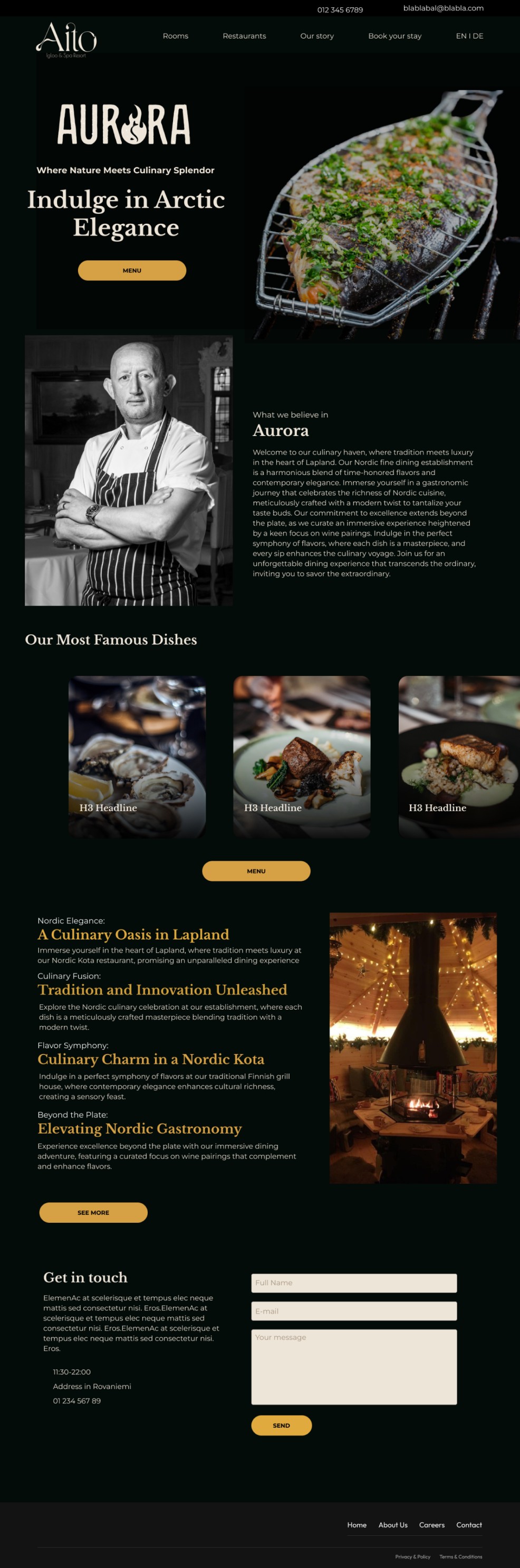
Aurora restaurant page, Aito resort

Aurora · Fine diningIts own flame-marked wordmark and warm, plated-food photography, a restaurant that feels distinct from the resort while still clearly Aito.

aitoresort.fi/restaurants/wildwoods
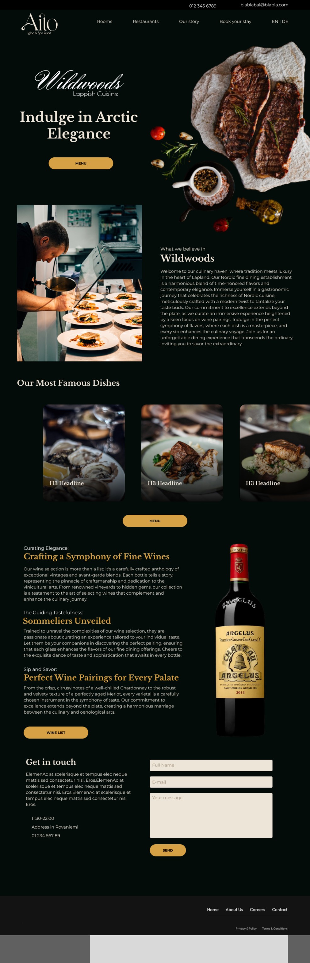
Wildwoods restaurant page, Aito resort

Wildwoods · Lappish cuisineA second restaurant with a hand-script mark and a focus on wine pairings, the same grid, a different mood.

aitoresort.fi/rooms/twin-bunk-deluxe
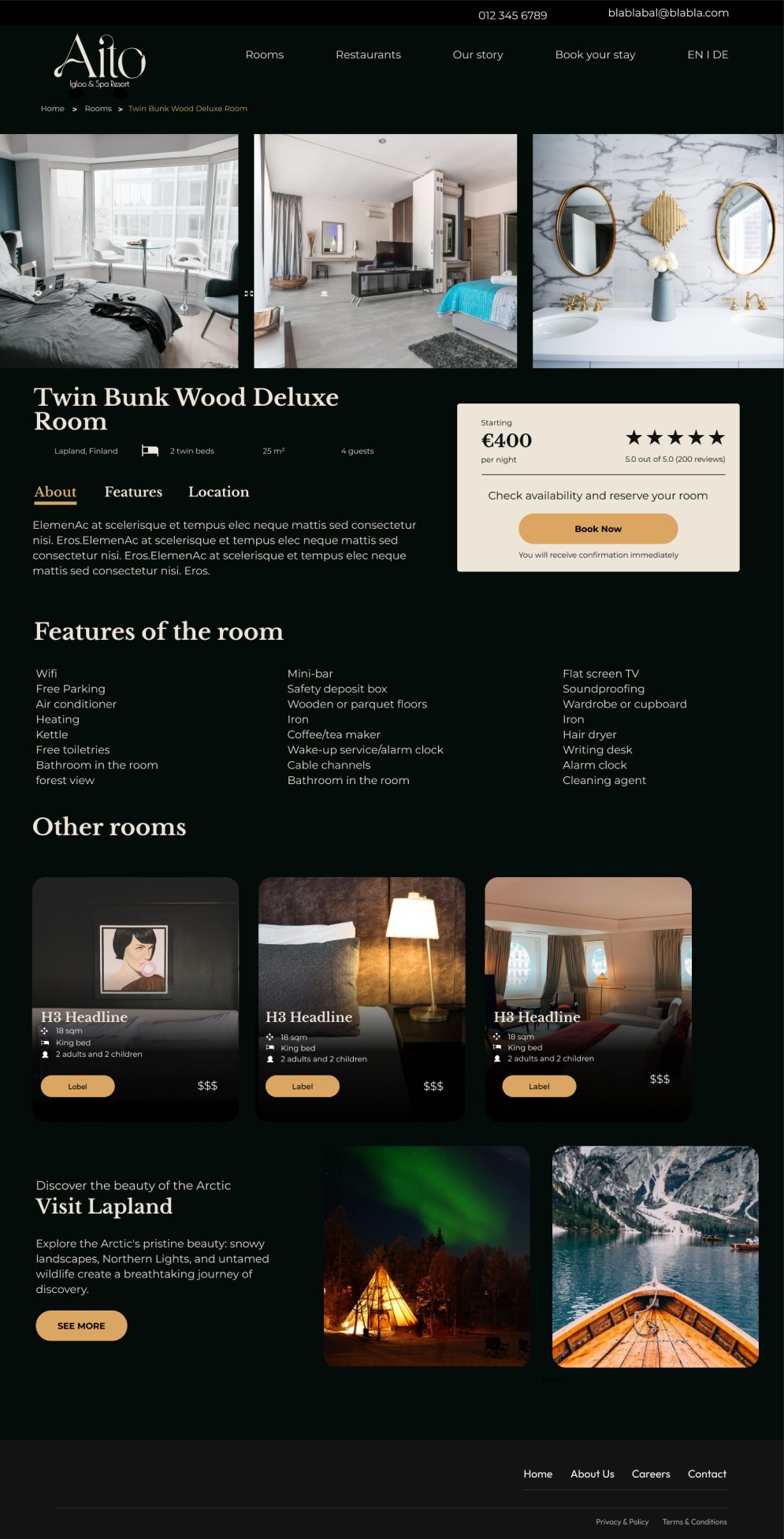
Room detail page with booking widget, Aito resort

Room detailGallery, specs, and a sticky booking card with price, rating, and a single clear action, the page that has to convert.

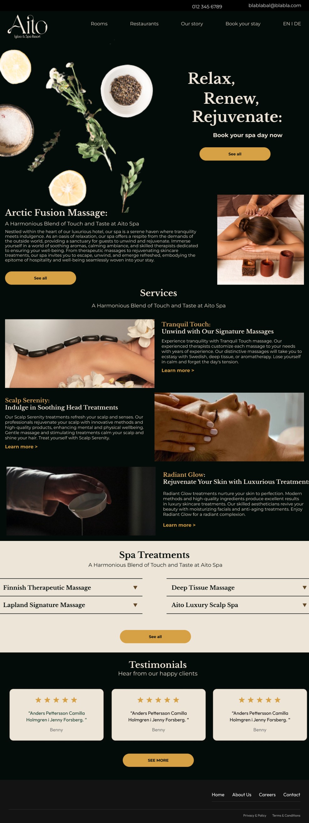
aitoresort.fi/spa
Spa page with services and treatments, Aito resort

SpaServices, expandable treatment lists, and testimonials, calmer pacing and more whitespace to match the subject.

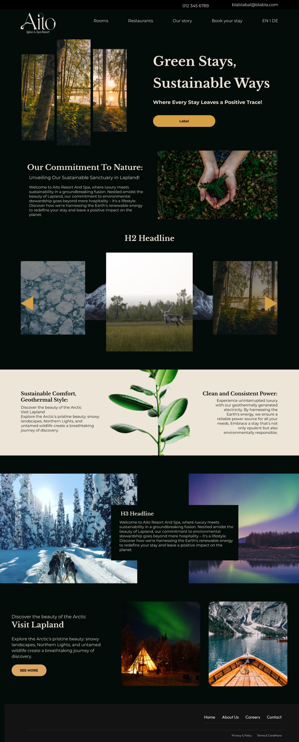
aitoresort.fi/sustainability
Sustainability page, Aito resort

SustainabilityThe brand's conscience: geothermal power, local landscape, and a cream interlude that breaks up the dark to make the message land.

Tap any page to open the full design. A dedicated homepage rounds out the six-page set.

Reflection

Branding is just UX with the lights turned down.

"The whole resort was a promise on paper. Every colour, every serif, every gold button was really answering one question: would you trust these people with your holiday?"

Owning both the brand and the interface meant the identity never drifted from logo to live screen, the same restraint that made the logo feel premium is what kept the booking flow calm. It's still my clearest example of designing a complete experience from a blank page, and the project that pulled me toward owning the full stack of a brand rather than just its screens.